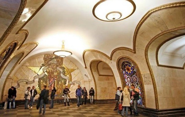
It is known for the splendour of its marble stations with giant candlesticks and colourful mosaics, but the expansion of the Moscow metro network has led architects to take the radical step of moving away from the Soviet style.
The first stations of the Moscow metro, opened under Stalin in 1935, were to be like « palaces for the people« . Nearly 100 years later, 21st century projects are much less formal, ranging from futuristic illuminated seats to laser-printed glass designs.
 Breaking with tradition, the town hall of the sprawling Russian capital has allowed independent architects to present projects that deviate from the norm. Competitions were sometimes accompanied by a public vote via a mobile application.
These changes pave the way for « original stations that move away from tradition, » says architecture journalist Nina Frolova.
The first of 15 new stations opened in August in the suburbs of Solntsevo, once known as a mafia stronghold. Moscow architects Nefa won the competition with a project inspired by sunlight, which gives its name to this district in western Moscow.
« We wanted to let the sun in, » says Nefa’s chief architect, Dmitri Ovtcharov, who drilled holes in the entrance walls to « create an effect of shadows and light, » while on the platforms, bright cylinders serve as seats for passengers.
More functional than before
For Nina Frolova, Editorial Director of the Archi.ru website, the Solntsevo station is a blatant example of these new trends, which highlight a more refined design, a brighter atmosphere and simple themes related to the station’s location or name. A style that has long been adopted by architects around the world, but which represents a small revolution for the Moscow metro, long attached to its world-renowned style.
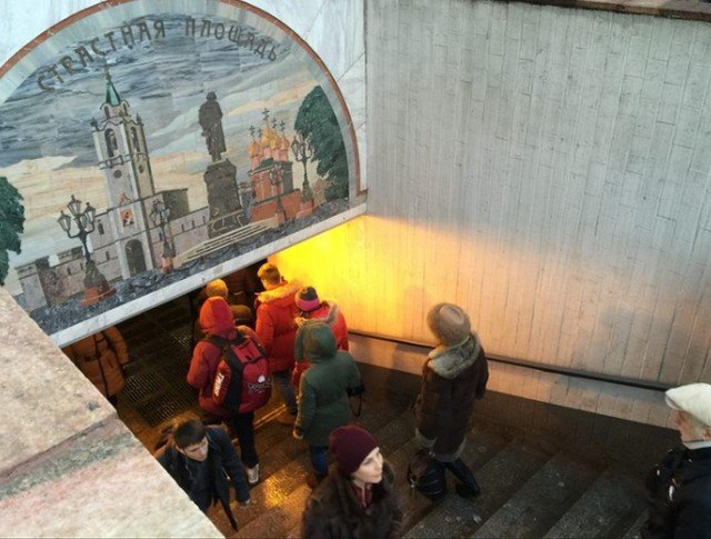
 The station under construction in Rjevskaya resembles a vast luminous vestibule bordered by arches opening on to the trains, a reference to the role of the square under which it is located as a gateway to the city.
The idea was to have an atmosphere « without excessive decoration« , in the image of « new times », explains Tatiana Leontieva, from the Moscow office Blank Architects.
« The competition had a great resonance, not only for the Russian architectural scene but also abroad, because there were people interested in a site like the Moscow subway, » she notes.
 At its conception, the historic metro was a monumental project, built to be an example of quality and solidity. It was to symbolize the greatness of Stalin and the very young USSR, to educate the masses about Soviet history, told in mosaics after a train set, and to serve as a bunker if necessary.
The new stations, more than 50 are planned for the next five years, are intended to be more comfortable and functional for passengers, and less impressive.
However, architects regret that quality does not always follow the example of the major projects that have changed the face of Moscow in recent years, which have been criticised for having been carried out in haste in order to meet deadlines, or even associated with accusations of corruption that have led to the choice of cheaper materials.
For Solntsevo station, « it was really a constant battle for quality, » says Dmitri Ovtcharov, complaining about poorly printed patterns and lights that didn’t work well. As for the Novoperedelkino station, its massive glass ceilings have fractured.